React: draggable, resizable dialogs
This is a React component I created to provide custom, draggable, and fully resizable dialogs. My goal was to develop a robust and easily customizable dialog component that I could quickly integrate into any future project. I drew inspiration from native Windows popups and JavaScript dialogs. The component includes three types of dialogs: Alert, Confirm, and Prompt.
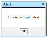
Alert
import { Alert } from './components/Dialogs';

export default function App()
{
    const [showAlert, setShowAlert] = useState(true);

    function handleAlert(props)
    {
        if(props.hasOwnProperty("anAlertDemo") == true)
        {
            setShowAlert(props.anAlertDemo);
        }
    }

    return(
            <Alert
                name="anAlertDemo"
                title="Alert"
                message="This is a simple alert."
                visible={showAlert}
                handler={handleAlert}
            />
    );
}
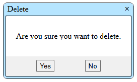
Confirm
import { Confirm } from './components/Dialogs';

export default function App()
{
    const [showConfirm, setShowConfirm] = useState(true);

    function handleConfirm(props)
    {
        if(props.hasOwnProperty("aConfirmDemo") == true)
        {
            setShowConfirm(false);

            //closed dialog without a responce... X
            if(props.aConfirmDemo == false) return;

            document.getElementById("output").innerText = `You answerd: ${props.aConfirmDemo}.`;
        }
    }

    return(
        <>
            <span id="output"></span>

            <Confirm
                name="aConfirmDemo"
                title="Delete"
                message="Are you sure you want to delete?"
                visible={showConfirm}
                handler={handleConfirm}
            />
        </>
    );
}
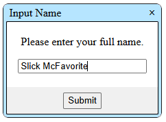
Prompt
import { Prompt } from './components/Dialogs';

export default function App()
{
    const [showPrompt, setShowPrompt] = useState(true);

    function handlePrompt(props)
    {
        if(props.hasOwnProperty("aPromptDemo") == true)
        {
            setShowPrompt(false);

            if(props.aPromptDemo != false)
            {
                document.getElementById("output").innerText = `You answerd: ${props.aPromptDemo}.`;
            }
        }
    }

    return(
        <>
            <span id="output"></span>

            <Prompt
                name="aPromptDemo"
                title="Input Name"
                message="Please enter your full name."
                visible={showPrompt}
                handler={handlePrompt}
            />
        </>
    );
}
Customize
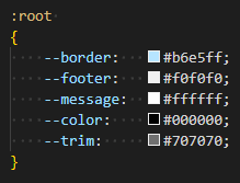
Customization is straightforward; you can modify anything you like. However, if you only want to adjust the dialog colors to match your site’s or project’s theme, you can do so by editing the CSS color variables at the top of Dialogs.css
Although users can resize the dialogs by dragging any edge or corner, you can specify the width and height props to achieve the desired inital dimensions.